I much appreciate the invitation of Myra Bacsal, her warm introduction of myself as an arts education consultant and the honour to discuss issues of literature and literacy in education. The entry point of this article is “the changing (out) look of books”. It is a reflection on my personal experiences with past and present practices. It deals with my beliefs as an educator and how to become familiar with the growing multimodal nature of books.
We have to accept that the face of literacy practices and reading are changing. Gone are the days that literacy in the traditional sense of the word is restricted to being fluent in reading, writing and speaking.
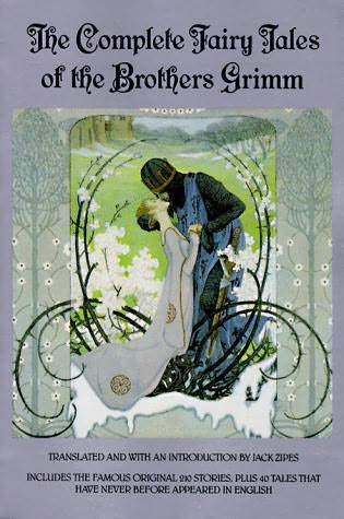
As someone from the first baby-boomer generation, I remember how I was only exposed to books after I could understand proper sentences. No doubt, I enjoyed storytelling. However, there was not much for me to look at, as at most of these books contained at least 95% of printed letters. Only a marginal portion was set aside for images. Some of them were truly beautiful artworks, such as the mythical pictures in a special edition of the Grimm brothers’ fairy tales.
However, most books contained images that were poorly done sketches with little eye for detail or imagination. My exposure to vast amounts of print developed my fluency in reading and writing skills. It also stimulated my imagination, as how else can one digest thousands of words. Honestly, it did not do much for developing any aesthetic affection for these books. Neither did the focus on the written word help those who were less fluent in reading.
My three sons grew up in, what I call, a sandwich literature generation. The shape and face of books were much in transition. Books were definitely much thinner than when I was young and contained fewer words and much more images. The content, greatly influenced by Dr. Seuss, was often a combination of funny rhyming words and texts that did not make much sense. Neither did the accompanying, and equally nonsense visuals. Reading at bed time with my boys was often a hilarious experience.
We improvised much and created our own rhyming texts. When I reflect on the content of these books, I have the feeling it did not do much to nourish their attention span, or reading and writing skills. But, it did give them quick wit in their verbal skills, an ability to use short four letter rhyming words (not always appropriately used), and a wicked sense of humor translated in them making up stories and plays.
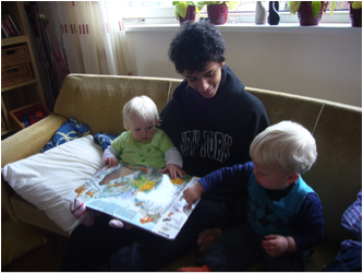
It is undeniable that the age of the reader is getting younger and the visual is taking the upper hand. Babies are exposed to books from the minute they are born and can find them clipped in their pram and floating in their bath tub. A look at the children’s book section of today shows that most books contain at least 75% visual and perhaps 25% words. There are even books that are 100% visual. Many books are beautifully illustrated although some leave much to be desired.
This changing nature of reading and the focus on the visual has consequences for the selection of books. It is worth to devote some time on reflecting on the changing outlook of books mean and how learning to read visuals can imbibe a love for reading or rather literacy practices for the next generation. In particular, to question ourselves how to nurture and guide these increasingly visual literacy practices. This means a need to address the decisions on the choice of the visual, its relation to the content and its possible effect on the (child) reader. Below are some considerations and tips when selecting a book:
Publisher and authors sometimes spend months to decide on the cover. In the publication of a local text book on practices with people with special needs, I was engaged as the photographer and supplier of the artworks. We had several discussions as to the content of the images on the front cover as well as those guiding the chapters. Issues that were involved were the position of the central images and the colours. In a more difficult term this attention to visual details is called “semiotics”. It is good for potential readers to equally, spend time “reading” the cover of the book. Ask questions such as “What message does the image give me and my child?” and “Do the images on the book cover carry negative gender/ethnic/cultural stereotypes?”.
Don’t be afraid if the title evokes emotions such as curiosity, anger, hurt, wonder or discussion or when words and fonts in a title may cause confusion or otherwise extend to the senses. Take the book “may I feel said he”, based on the poems by E.E. Cummings and the paintings by Marc Chagall.
The lack of capitals and different fonts in the title and its relation to the beautiful artwork on the cover are in itself worth many hours of discussion. However, books are very much an individual choice and not every book may have the same appeal. While I thoroughly enjoy poetry and the mythical paintings of Chagall and discussions about the world of imagination and feeling, I recognize that not everyone may be comfortable with this type of content.
 I believe a book is not to be read only once and then to sit on the shelf for a lifetime. There are many books that provoke thought and allow extension in many ways, and thus can be used throughout a lifetime. A great all-age appropriate book is “I see a song” by Eric Carle. It is a book without words which I have “read” (or rather danced) many times for many different age groups, from tiny toddlers to primary school students and adults. One of my favourite ways of” reading” this book is to have it accompanied by a variety of mood music. This can range from happy to very dark music. With each different genre music, the context as well as the content changes.
With visual images at the core of literacy experiences I draw attention to extend the imaginative, the aesthetic and the affective domains to literacy practices. When guiding our children to engage and relate to literacy practices, we must allow them to question and connect meaning to stories and nurture complex multimodal literacy practices. “It’s a book” by Lane Smith draws attention to ongoing debate of the internet and visual versus traditional text. Thanks to the initiative of Myra Bacsal and the other people behind “Gathering Books” , this forum is an example of how to blog about the visual versus texts, the values and practices of contemporary literacy and its effect on the reader.
As part of my work as an arts based consultant and trainer, I have designed a special workshop called “To imbibe a love for reading”. Central to this workshop is the focus that reading and choosing a book is an individual experience. However, guiding and nurturing children with the right questions, so as to become better readers needs to be part of a common practice. This will allow better decisions as to the value and meaning of reading. It will give more opportunities for children to become more creative, better communicators and to release the potential of their imagination.
Esther Joosa (PhD Candidate) is the driving force behind “Arts of the Earth”, an international arts education consultancy. Originally from the Netherlands she has lived and worked in Singapore and the region for the past 23 years. Her work is based on giving voice through art, creativity, multimodal literacy and the teacher as (art) researcher. She has a wide variety of clients ranging from museums to schools to volunteer organizations. Esther has published several papers as well as a book chapter. She has presented at many international conferences and curated various art exhibitions, developed outreach programs and has conducted a vast array of professional development workshops and masters classes. For more information you can contact esther.joosa@artsofthearth.com or visit her website at www.artsofthearth.com


1 comment
Aline Pereira
July 8, 2011 at 6:16 am (UTC 8) Link to this comment
Thanks for the great article. I love the idea of “reading” book covers in addition to the stories between them. They sure are a treasure in and of themselves.
Do you have any thoughts on digital book covers such as these: http://blog.seattlepi.com/bookpatrol/2010/08/05/the-rise-of-the-digital-book-cover/
I find them fun, but they take a little bit of the magic of “discovering a book by its cover” away… I like being left with a little more to imagine, personally.
Thanks again. I look forward to more posts in this series!